When someone clicks on your ad, email, or social media post, your landing page is the first — and maybe only — chance to convince them to take action. It’s not just a digital “stop” on their journey; it’s the moment when curiosity can become a real customer relationship.
But here’s the thing: building a high-converting landing page isn’t about throwing flashy graphics and catchy headlines together. It’s about following smart Landing Page Best Practices, applying proven landing page tips, and understanding what makes a great landing page.
The magic happens when your landing page feels so clear, natural, and compelling that visitors don’t even think twice about clicking that button.
In this guide, we will break down everything you need, fundamental strategies that work, not theories. You’ll also learn why most blogs miss the real reasons landing pages succeed or fail…and how you can do it differently.
You’ll find powerful landing page advice and learn how to Optimize Landing Page performance at every level.
Essential Landing Page Best Practices to Drive Conversions
Ready to build landing pages that drive conversions? Below are 11 essential landing page best practices proven to deliver results. These strategies are designed to maximize user engagement, reduce bounce rates, and guide visitors toward taking meaningful action.
Whether you’re new to creating landing pages or looking to fine-tune your current ones, these practical tips will help you optimize each element for better performance. Let’s dive into each best practice and see how you can implement them effectively.
1. Have One Clear Objective: Keep It Focused
When designing a landing page, one principle reigns supreme. A landing page should have a single, clear goal for visitors. The more straightforward your objective is, the better the chance of success.
- Clarify the Objective: Whether you want visitors to subscribe, purchase, or sign up, ensure the call to action (CTA) and messaging are tailored to that specific goal.
- Design Around the Goal: Every visual and text element must reinforce your page’s primary objective. Cut out anything that doesn’t contribute to that goal.
- Remove Distractions: Avoid external links or elements that could divert attention from your target action.
- Establish Clear Visual Hierarchy: Use headings, contrasting colors, and layout to guide visitors’ eyes from your headline to the call-to-action. A clean structure ensures users stay focused and know exactly where to look.

Keeping things simple and direct ensures that your visitors know exactly what to do and why. Stay focused on a single objective. The clearer your goal, the easier it will be for visitors to follow through.
2. Simplify Your Design — Less is More
When it comes to landing page design, minimalism is your best friend. A cluttered page can overwhelm visitors, making them second-guess their decision to stay. Less is more because it creates a smooth experience that guides visitors naturally toward the goal.
- Prioritize Key Elements: Your page should include only the essential elements—CTA, headline, key visuals, and supporting copy. Each element should have a clear purpose that has a high chance of converting the landing page.
- Whitespace is Your Ally: Don’t be afraid of space. It helps direct attention to the most critical parts of your page.
- Visuals: Choose clean and purposeful images that complement your message rather than detracting from it. Avoid background images that overwhelm the text.
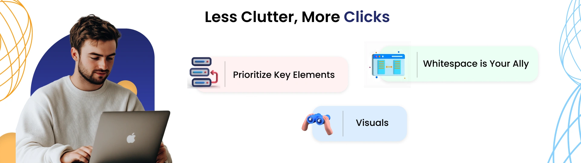
A simple design directs the visitor’s focus where you want it to go—on the key action. It also eliminates distractions that could cause them to bounce. Strip your landing page down to the essentials. Every element should be purposeful and aligned with your goal.
3. Craft a Compelling, Benefit-Driven Headline
Your headline is the first thing visitors see, and it sets the tone for the rest of their experience. The goal of your headline is to immediately capture their attention and communicate why they should care about your offer.
- Highlight the Benefit: Instead of focusing solely on what you’re offering, tell visitors how they will benefit from it. For example, instead of saying “Buy our Software,” say “Save 3 hours a week with our time-management software.”
- Use Actionable Language: A good headline compels action by using strong, actionable language. It promises a solution to the visitor’s problem.
- Be Specific: Vague headlines are ineffective. The more specific you are about what the visitor will gain, the more likely they’ll be to continue reading.
People are more motivated by outcomes than features. By showing visitors why your offer is essential, you connect emotionally, making them more likely to convert. Craft a headline that addresses the visitor’s needs and communicates the benefits of taking action.
4. Use Social Proof for Trust and Credibility
People naturally rely on the opinions of others when making decisions, especially when purchasing or trying out new brands. This is where social proof comes into play.
- Customer Testimonials: Real testimonials from happy customers show that others trust your product or service.
- Client Logos: If you have recognizable clients or partners, showcase their logos. This builds authority and reassures visitors that they’re in good company.
- Trust Badges: Certifications, awards, or even security badges (for payment) help reinforce that your business is reputable and trustworthy.
- User Reviews or Ratings: Show average ratings, review counts, or even featured customer quotes. Platforms like Google, Trustpilot, or app stores can offer powerful third-party validation.
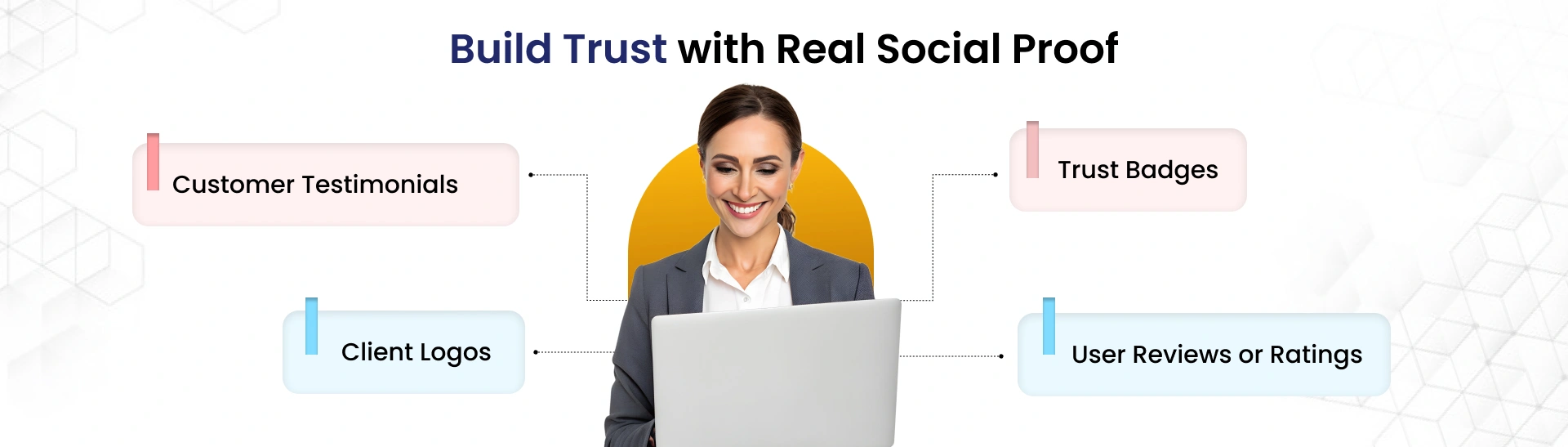
Social proof taps into our innate fear of making the wrong decision. If others have succeeded, visitors feel more confident about their choice. Use real testimonials, client logos, and trust signals to increase credibility and help visitors feel secure in their decision.
5. Create Urgency with Limited-Time Offers
Creating a sense of urgency motivates visitors to act quickly. This technique works on the principle of FOMO (fear of missing out).
- Countdown Timers: A timer showing the time remaining for an offer or discount creates a sense of urgency.
- Limited Availability: Highlight that spots, products, or deals are limited—e.g., “Only 3 seats left” or “While supplies last.”
- Precise Expiry Date: Make the offer’s expiration date visible, so visitors know they need to act fast to avoid missing out.
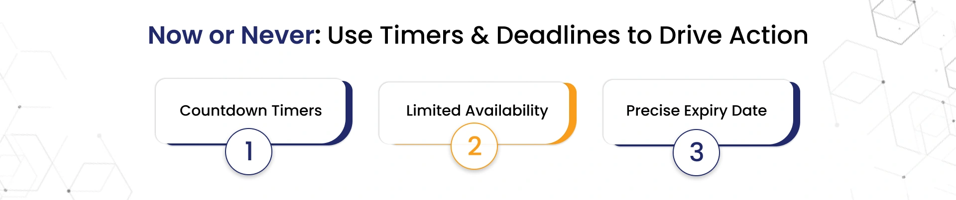
Urgency taps into human psychology—specifically, our instinct to act quickly when there’s a fear of loss. It encourages visitors to act before the opportunity disappears. Use urgency to spur immediate action, but ensure that it feels authentic and not forced.
6. Make the Call-to-Action (CTA) Unmissable
The CTA is the most crucial element on your landing page. Without a strong, visible CTA, all the other elements are irrelevant. It’s the action point where visitors turn into leads or customers.
- Action-Oriented Language: Use action verbs like “Get Started,” “Join Now,” or “Claim Your Free Trial.” This drives people to take action.
- Design for Visibility: The CTA should be big enough to stand out but not so overwhelming that it distracts from the content. Use contrasting colors to make it pop.
- Strategic Placement: Place the CTA both above the fold (so it’s visible without scrolling) and at the bottom of the page for visitors who scroll to the end.
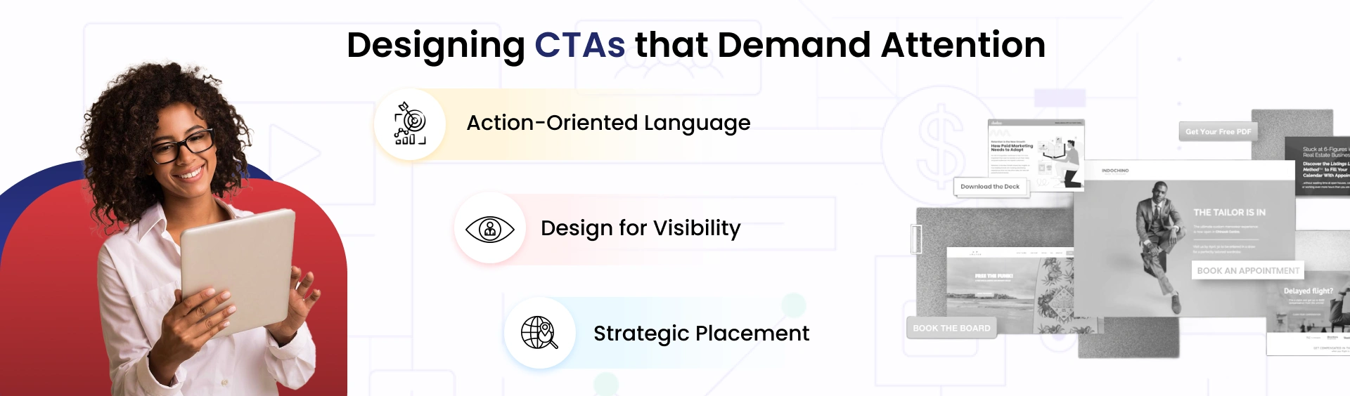
A clear, compelling CTA provides a sense of direction. It tells visitors exactly what to do next, reducing the chances of indecision. Make your CTA large, bold, and strategically placed. It should always stand out and encourage immediate action.
7. Highlight the Benefits, Not Just the Features
Most people don’t buy products—they buy results. Instead of focusing on a long list of features, emphasize how your offer will solve the visitor’s problem or improve their life.
- Use Benefit-Focused Language: Highlight how your product or service helps the visitor achieve their goals. Instead of listing a product feature, say how it saves time, boosts productivity, or enhances a skill.
- Lead with Outcomes: For example, “Save 20 hours per week with our tool” is more compelling than “Our tool has automated reports.”
People buy based on the emotional value they’ll get from a product, not just its features. Emphasizing benefits builds a stronger connection and motivates action. Focus on benefits, not just features, to speak directly to the visitor’s desires and needs.
8. Include a Clean, Simple Form
Forms are critical to conversion, but they should be as simple as possible. A long form or one that asks for unnecessary information can turn potential customers away.
- Minimize Fields: Only ask for the information you truly need. Name and email should be enough for most offers.
- Single-Column Forms: Multi-column forms are more complicated to read and fill out. Stick to single-column layouts to create a cleaner, more streamlined experience.
- Clear Labels: Make sure form fields are clearly labeled, and if necessary, provide tooltips or hints to guide users through the process.
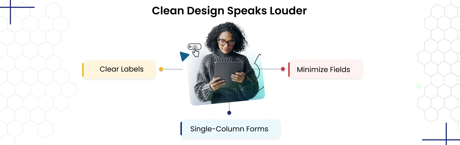
Simplicity reduces friction, and visitors are more likely to complete forms that are easy to fill out. Keep your forms short, simple, and easy to understand to avoid frustrating visitors.
9. Offer a Risk-Free Trial or Guarantee
Risk is a major barrier for potential customers. To overcome this hesitation, offering a risk-free trial or money-back guarantee can make all the difference.
- Money-Back Guarantee: This removes the visitor’s fear of making a purchase they might regret.
- Free Trial: Allowing visitors to experience your product without a financial commitment builds confidence and increases the likelihood of conversion.
A guarantee signals that you stand behind your product, which builds trust and makes visitors feel secure about their decision. Offer a risk-free trial or money-back guarantee to reduce hesitation and increase conversions.
10. Optimize for Mobile Devices
With mobile traffic now accounting for a large portion of online visits, optimizing your landing page for mobile is no longer optional.
- Responsive Design: Ensure your landing page adjusts seamlessly to different screen sizes, from smartphones to tablets.
- Fast Load Times: Mobile users expect pages to load quickly. A delay of even a few seconds can lead to a high bounce rate.
- Touch-Friendly Elements: Make buttons large enough to be easily clickable on mobile devices, and ensure text is readable without zooming in.
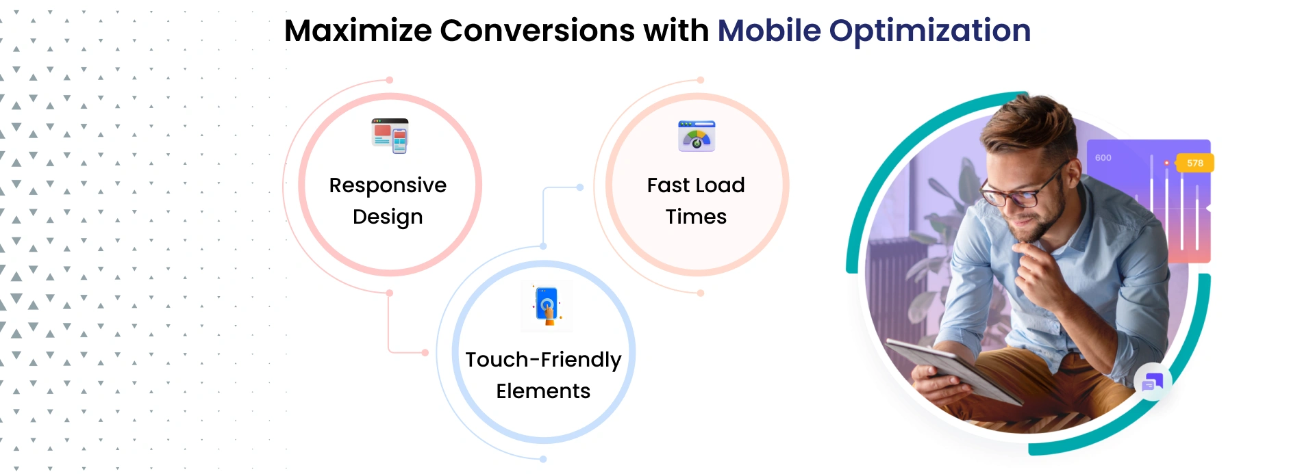
With more users browsing on mobile devices, ensuring your landing page works flawlessly on all screens is crucial for conversion. Optimize your landing page for mobile to ensure it provides a smooth experience on every device.
11. Optimize for SEO
Effective SEO optimization can increase your landing page visibility, helping more potential customers find you through search engines. Without proper SEO, even the best landing page design might not reach the right audience.
- Keyword Integration: Make sure you use relevant keywords in strategic places like the title, headings, and body text to ensure your page ranks well for relevant search terms.
- Meta Descriptions & Tags: Write clear, concise meta descriptions and title tags that accurately describe the page content. These are important for improving click-through rates from search results.
- Alt Text for Images: Add descriptive alt text to your images. This helps with SEO and ensures accessibility for users with visual impairments.
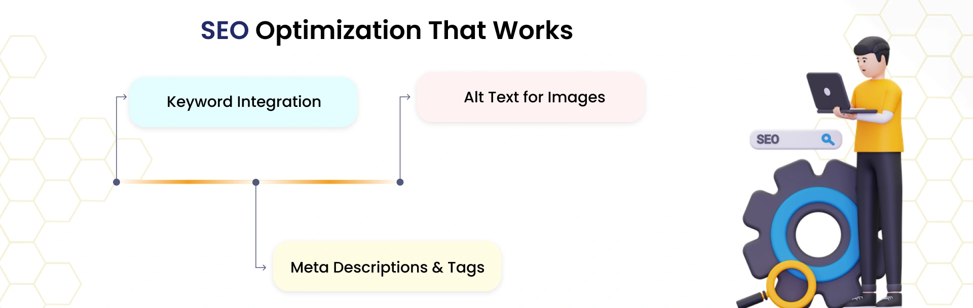
SEO is key to getting your landing page in front of the right audience. Proper optimization ensures you rank higher in search results, bringing more organic traffic to your page. Optimize your landing page for SEO by using relevant keywords, adding meta descriptions, and improving image accessibility to increase visibility and attract organic traffic.
Advanced Landing Page Tactics to Boost Conversions
Once you’ve mastered the basic landing page best practices, it’s time to take your strategy up a notch. The following advanced tactics are designed for those who want to optimize their landing pages even further, pushing conversions to new heights with cutting-edge tools and unique approaches.
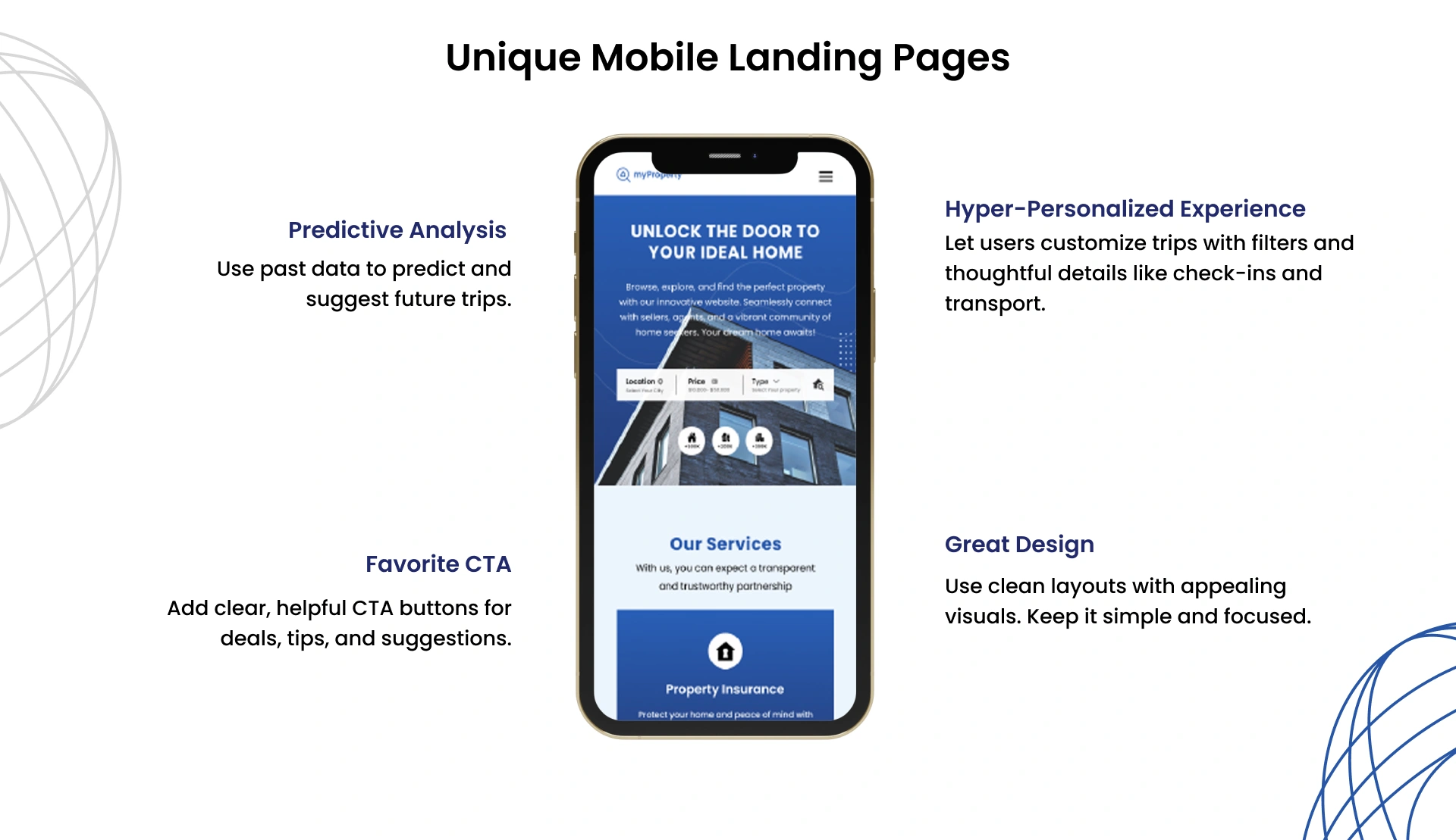
1. Hyper-Personalization with Predictive Analytics
While personalization is standard, hyper-personalization based on predictive analytics takes things to the next level. By leveraging machine learning and AI, you can predict a visitor’s behavior and tailor the content in real time. For example, you could show dynamic offers depending on their browsing history, geographic location, or past interactions with your business.
How It Works:
- Use tools like Dynamic Yield or Evergage that offer predictive analytics and real-time personalization.
- Personalize not just the message, but the design, product recommendations, and CTAs based on predicted behavior.
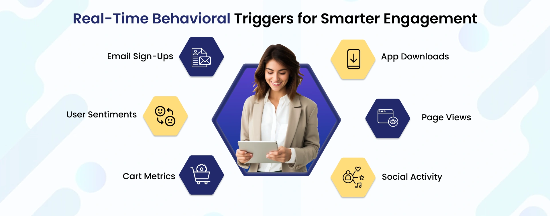
2. Behavioral Triggering for Real-Time Interaction
Behavioral triggers go beyond pop-ups. By monitoring user actions, you can prompt personalized actions, such as custom messaging, exclusive deals, or timed CTAs, based on specific behaviors on your landing page. For example, if a visitor has been on the page for more than 30 seconds but hasn’t interacted with the CTA, a small personalized message can appear to encourage action.
How to Implement:
- Use tools like Vero or ActiveCampaign that allow you to set up behavioral triggers and actions.
- Customize your triggers to appear at specific points in the user journey (e.g., after a certain amount of scrolling or interaction).
- Base your triggers on key behavioral data points such as page views, app downloads, social activity, email sign-ups, user sentiments, and cart metrics to ensure timely and relevant interactions.
3. Gamification for Increased Engagement
Gamification introduces fun elements to your landing page by adding features like quizzes, progress bars, challenges, or reward systems. When used effectively, gamification can boost engagement, increase time spent on the page, and ultimately lead to higher conversion rates.
How to Implement:
- Create quizzes that help visitors identify which product or service is right for them, offering them a tailored recommendation based on their answers.
- Use progress bars to let users see how far they’ve progressed in completing a form or process (e.g., “Only 3 steps left to get your free consultation!”).
Offer rewards for completing specific actions, such as a discount after filling out a form or completing a quiz.
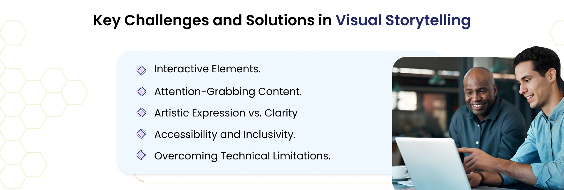
4. Advanced Visual Storytelling with Interactive Elements
Interactive elements such as scroll-triggered animations, hover effects, and interactive infographics can bring your landing page to life. Instead of a static, one-dimensional page, you offer a rich, dynamic experience that draws visitors in and encourages exploration.
How to Implement:
- Use tools like Webflow or Adobe XD to integrate scroll-triggered animations or interactive graphics.
- Be mindful of technical limitations by optimizing your designs for performance, compatibility across devices, and varying browser capabilities.
- Balance artistic expression with functionality to maintain both creativity and clarity.
- Ensure accessibility and inclusivity by designing interactive elements that are keyboard-navigable and screen reader-friendly.
- Use attention-grabbing visuals and motion to guide users through the story without overwhelming them.
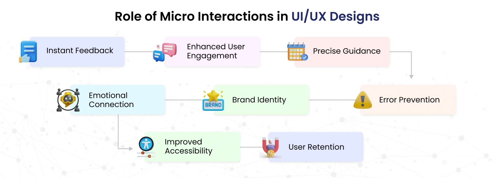
5. Utilizing Micro-Interactions for Delightful User Experiences
Micro-interactions are subtle animations or actions that respond to user behavior. These tiny but powerful elements—such as a hover effect on a button, a sound when a form is successfully submitted, or a smooth animation when a visitor scrolls—create a delightful user experience and can significantly improve conversions. When implemented thoughtfully, micro-interactions deliver instant feedback, drive enhanced user engagement, offer precise guidance, and support error prevention. They also foster an emotional connection, reinforce your brand identity, ensure improved accessibility, and contribute to stronger user retention.
How to Implement:
- Design subtle animations using tools like Principle or InVision.
- Use micro-interactions for elements like buttons, form fields, or image galleries to keep the user experience smooth and engaging.
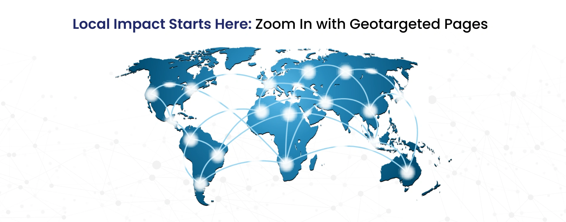
6. Geotargeting for Localized Landing Pages
If your business operates in multiple regions or has local customers, geotargeting is an excellent strategy. By tailoring your landing page content based on a visitor’s geographic location, you can offer highly relevant content, such as local offers, event information, or region-specific testimonials.
How to Implement:
- Use geotargeting tools like GeoTargetly or IPinfo to detect the location of visitors.
- Customize the landing page with localized content, such as pricing in local currency, city-specific offers, or customer testimonials from the same region.
Conclusion
Strong landing pages aren’t built by chance — they’re built through wise choices. When you apply the right landing page best practices, use practical landing page tips, and think carefully about your landing page strategy, you turn a simple page into a powerful growth tool.
But getting every piece right takes time and experience.
That’s why JanBask is here to help.
We focus on real-world landing page optimization best practices that are proven to increase conversions. From giving you trusted landing page advice to helping you create a landing page design and messaging, we’re ready to support your successive big win.
Your visitors are just one great landing page away from becoming loyal customers. Let’s build it together.
Game Center
Game News
Review Film
Berita Olahraga
Lowongan Kerja
Berita Terkini
Berita Terbaru
Berita Teknologi
Seputar Teknologi
Berita Politik
Resep Masakan
Pendidikan
Berita Terkini
Berita Terkini
Berita Terkini
review anime
Gaming Center
Originally posted 2025-05-23 19:00:31.